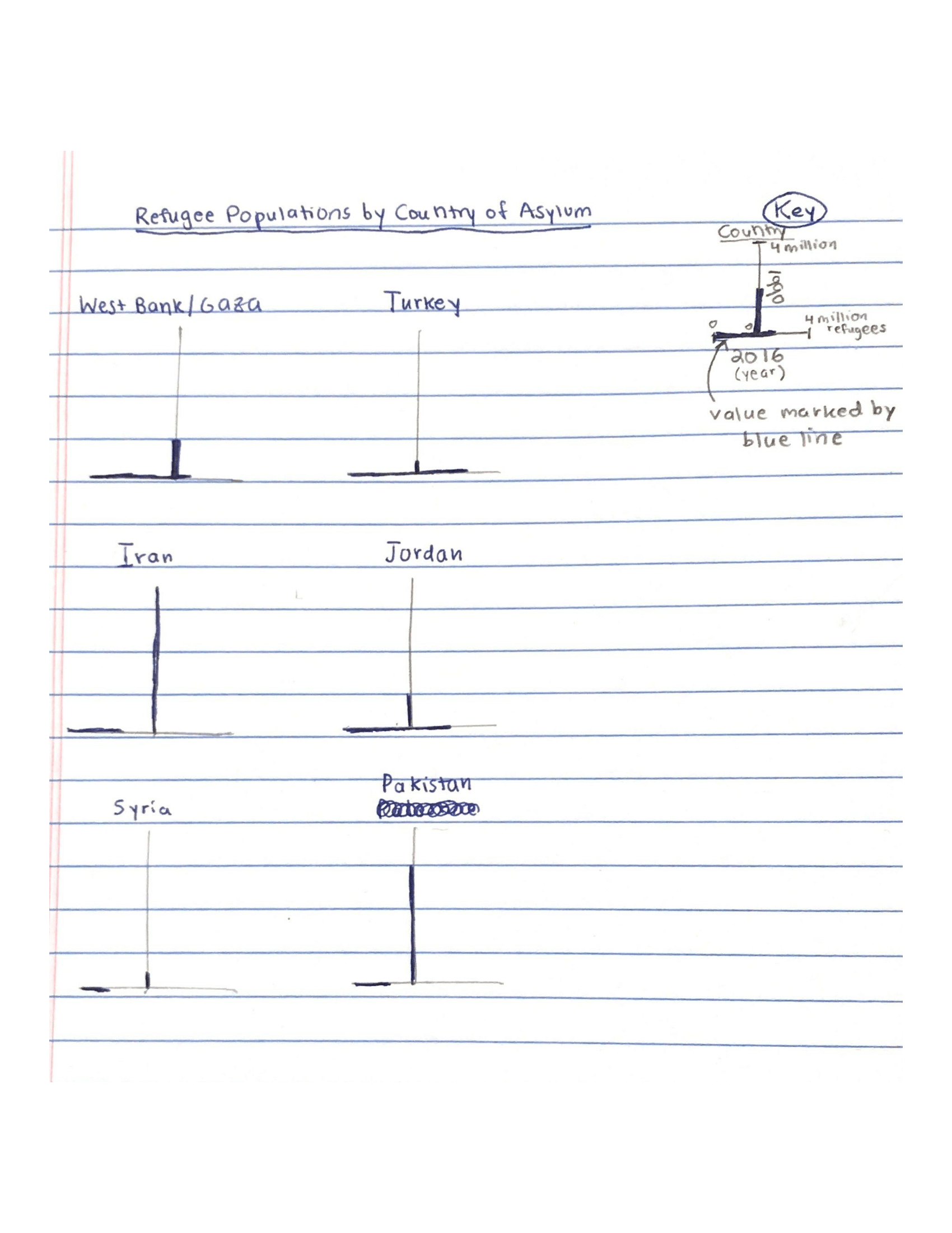
This visualization presents data provided by the World Bank on refugee populations over time by country/territory of asylum (data source can be found
here). My design compares the number of refugees in 1990 and in 2016 by country for a select subset of countries. However, it does this in a very unintuitive and misleading depiction manner for a few different reasons:
- The design employs the vertical-horizontal illusion by using two equal-length lines in a bisecting fashion for the scales representing population numbers in 1990 and 2016. This illusion makes the vertical line, for 1990, appear longer than the horizontal, for 2016, thus possibly biasing readers into thinking that the 1990 refugee populations are relatively more than the 2016 ones than they actually are. This could lead to misled opinions such as that West Bank/Gaza has had a lesser increase in refugee population than in reality, or that Iran has had a greater decrease in refugee population than reality.
- 1990 and 2016 cannot be directly compared to each other because they are not on the same parallel axis, thus making it much harder for the reader to directly compare how refugee populations between the two years and instead put in more thought into estimating the values and comparing them mentally, not visually.
- The scale is not clearly marked on these lines with number values and ticks across the axis range. The reader must refer to the key to estimate what the population data being presented is rather than directly read it off the plots, thus adding levels of uncertainty in these population values that additionally make comparison much harder.
- The reader cannot directly or easily compare refugee population numbers by country, as each is plotted on separate adjacent line graphs rather than on the same graph.
Overall, these design decisions make it much more difficult for the reader to intuitively understand the data being presented, even though it is presented in a technically accurate manner. The use of illusions can further distort this already obscured understanding, therefore leading the reader down a path towards potentially more problematic takeaways from this story. View the sketch of my visualization below, for a selected subset of countries.